Winter Spice - Diamine
- cloghopper72
- Dec 11, 2022
- 2 min read
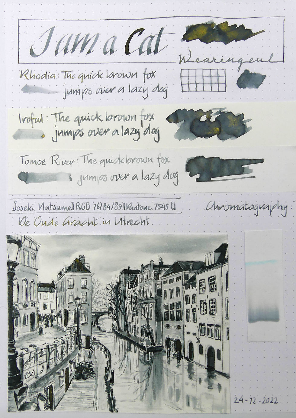
Winter Spice is part of the Red Inkvent series of 2021. I've seen many reviews on the Internet about this ink and it seems people either love it or hate it. I've also seen reviews of people who didn't like it at first but later came to love it. I've loved it from the start. But I can imagine why one would dislike it. It is a really beautiful reddish brown. But it has a strong toxic green sheen over it and a cool blue shimmer. It's a strange combination. And I must admit I don't like it on Tomoe River paper. But I'll explain that later. Here's the entire sheet I've made.

Taking photos of this ink wasn't easy but I did my best. Anyway... the writing samples. I used for the writing and for the lines in the sketch my Franklin-Christoph Model 66 pocket with a S.I.G. F nib.
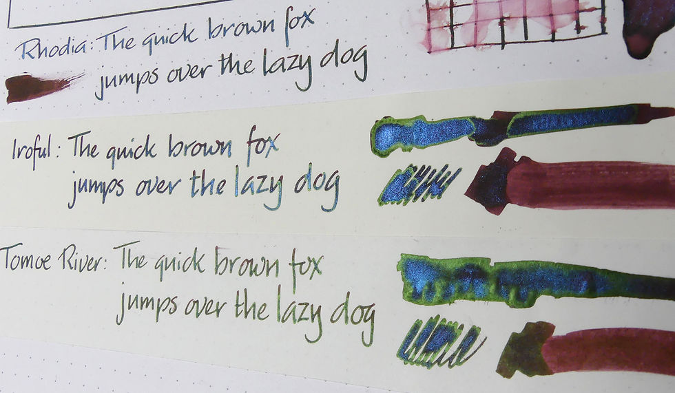
Like I said. Not my favourite on Tomoe River. The sheen on the writing samples changes depending on the paper you use. Rhodia paper has the least amount of sheen showing, the sample on Iroful a bit more and on Tomoe River it is totally covered by the green sheen. I prefer Iroful for this ink. The sheen shows of in the more saturated parts of the writing and also the shimmer sparkles very festive but still you can see the brown of the base colour. A perfect balance. On TR you could not make out what the actual base colour of the ink was. And Rhodia doesn't show the sheen enough in my opinion.

Next: the chromatography. It starts with a good amount of reds. First a cooler then a warmer red. Next a strong yellow and blue. No surprise there.
But look at the little piece of watercolour paper at the top. I noticed the bright green showing up in the sketch I made. I tried to get it out in samples but it was difficult. It would need a bit more experimenting to find out how to get it out for sketching.
You can see in the sketch in a very few small part a tiny bit of the green (in the centre of the sketch). I used a very diluted wash there at the base and later went over it with pen for drawing the grass and sand.

In the dark ink parts (the grass for example) the shimmer shows up nicely. And I must say that I like it better with the shimmer. The reddish brown is a bit strong in the painting but the blue shimmer cools it down somehow. The sheen doesn't show up on this paper. And for this subject it was maybe better so.
This is the beach in the North-West of the island Schiermonnikoog in the Netherlands. The red lighthouse in the background.


This ink fits well the subject !