Dusky Pink - Robert Oster
- cloghopper72
- Jan 5, 2023
- 2 min read
Dusky Pink is a muted pink by Robert Oster. It is part of the 1980's series of inks.

I really want to love this ink but I fight with it a lot. I blamed it before on my pen and nib that might have been too smooth (?). But also the ink doesn't hold on to other nibs as much as I like. And that really is a pity.

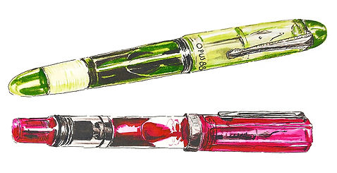
Perhaps I need to keep looking for that one pen that understands this ink. For now I have it in a Kaweco Sport with a BB nib and it is okay. TWSBI didn't speak Dusky Pink. We'll see...
The ink is unsaturated pink that looks a bit dusty (but I guess dusky sells better). It's a colour I love. It is almost lavender or purple. Mauve is maybe the best name to describe it. It's a bit watery but not too pale. You can still read what the brown fox did. In saturated puddles of ink it can get a very velvety look and make pretty contrasts. And the shading is wonderful.

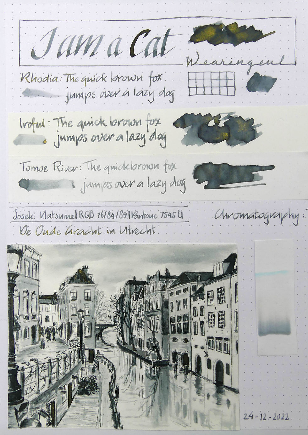
The chromo of this ink is very straight forward. Pink, a gap of watery nothingness and finally a stripe of cerulean blue.
the sketch. This time I sketched the gate building of castle Nyenrode in Breukelen. The village where I grew up. The river in front of the castle is the river Vecht. I don't like the castle very much. It looks a bit too much kitschy to me. Even though it really is a very old building (or at least parts of it are). Now it is an international business university.
In my last year of secondary school I had to make a drawing in graphite of the castle from the gardens. That was fun but I remember I made the drawing too large for my paper and the top of the tower didn't fit on it, so I made the tower shorter than it actually was.
Anyway, this is the gate building and this is a nice view from the river. The ink works well for sketching. Nice to build up aerial perspective. The only vexing thing is (again) the ink not gripping onto the dipping nibs. Perhaps I could try adding a tiny drop of liquid Arabic gum to the water or ink. It might help.


Comments