I am a Cat - Wearingeul
- cloghopper72
- Dec 24, 2022
- 3 min read
A few weeks ago I got this ink from Sinterklaas (or Sint Nicolaas, the Dutch/European predecessor of Santa Claus). I didn't know this ink and never heard of it before. So it was a fun surprise. I Googled the ink and found out on the website of Scrittura Elegante (where this ink was bought) that this is a Natsume Soseki Literature ink, a series based on the fiction of Natsume Soseki.
‘I am a cat’ is an ink that portrays a cat’s perspective, looking from a distance at the pessimistic world it is full of irony. Inspired by the glittering eyes of a cat, the ink has a unique color in which golden shimmers are spread on top of a cool grey.
The color motif and feel of words in literature is illustrated in the inks. The No.7 Natsume Soseki literature ink series consists of 3 ink colors: I am a cat, Sanshiro, The Mind.
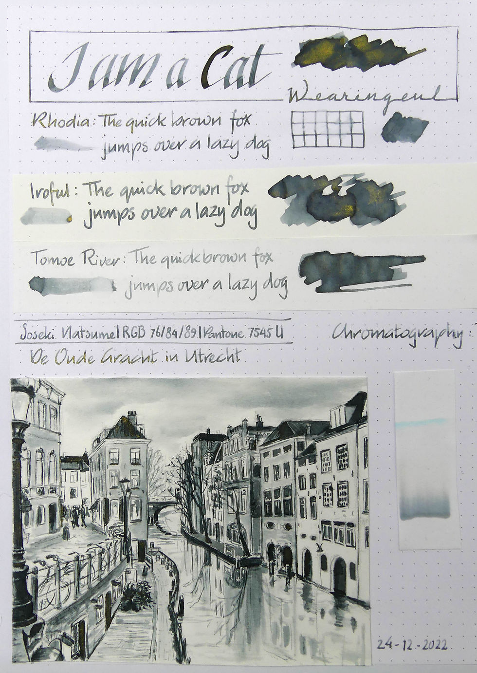
The ink is a nice cool grey with lots of gold shimmer. Using a dip pen makes the lines much darker. In a fountain pen it is a medium grey with nice shading. A bit dry, which I could feel when sketching with my fine dip pen.
The gold shimmer settles really fast on the bottom of the bottle so I had to shake it very often. I haven't tried it in a fountain pen and I think I won't use it in a fountain pen ever. Just too much shimmer I think. But in these samples with the dip pen and dipping my Kaweco Sport in the bottle it was ok.


On all 3 papers the ink looks beautiful. As I said, lots of gold on top of the ink. And very pretty shading. No sheen. The water test showed that the ink doesn't dissolve very easy. It's not permanent or waterproof but most of it stays where it is.

The chromo shows at the bottom the line with gold shimmer followed by a medium grey. Then a very very faint ivory part followed by an even more faint pink (you can't see that on the photo). At the top a very bright line of cyan blue.
The sketch was a bit difficult. Not because of the subject but because of this ink. It didn't get much grip on the thin dip pen. Or maybe it was the watercolour paper that just didn't want this ink. Also the fact that the ink, once dried, didn't dissolve as much as I would have liked which made the washes a bit difficult. Another issue I have with this ink is that the gold is easily wiped off with your finger when it's dry. Some will stay but a lot will be on your fingertips.
The sketch I made with this ink is a view over the Oude Gracht (the Old Canal) in the centre of the city Utrecht, the Netherlands. I love this city. Maybe even more than I love Groningen. Like Groningen it is a University city. Full of students. And full of bicycles. But then again, every Dutch town is filled with bikes. As a child I came here often and as a student it was a nice place to party and shop. I will sketch another look over the canal in another drawing with another ink and maybe tell a bit about them. Like how they differ from the canals in Amsterdam for instance.
But for now you will have to do with this one. In I am a Cat.

Oh, almost forgot.... On a tiny card inside the packaging were the RGB and Pantone numbers: RGB 76/84/89 and Pantone 7545 U.
I like that!


Lovely riverscape !