Ink Studio 573 - Sailor
- cloghopper72
- Jan 3, 2023
- 2 min read
Gorgeous, gorgeous, gorgeous... Such a pretty ink. Nice for writing but absolutely great for sketching. Let's have a look.

Warm, sunny and exciting multi tones.

The ink is not very saturated and makes lovely shading in the writing. As always the writing on Iroful is my favourite. I just can't help it, I love that paper. But on the other papers this ink behaves great too. Not very waterproof. Not at all really.
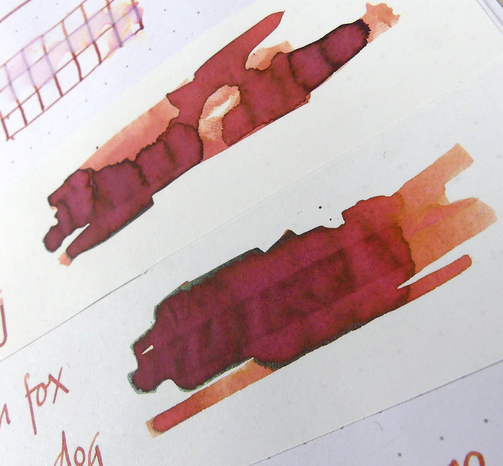
On Tomoe River it makes a tiny bit of a green sheen crust on the edges. But only in the heavy pooled ink splashes. (but look at the shading!)

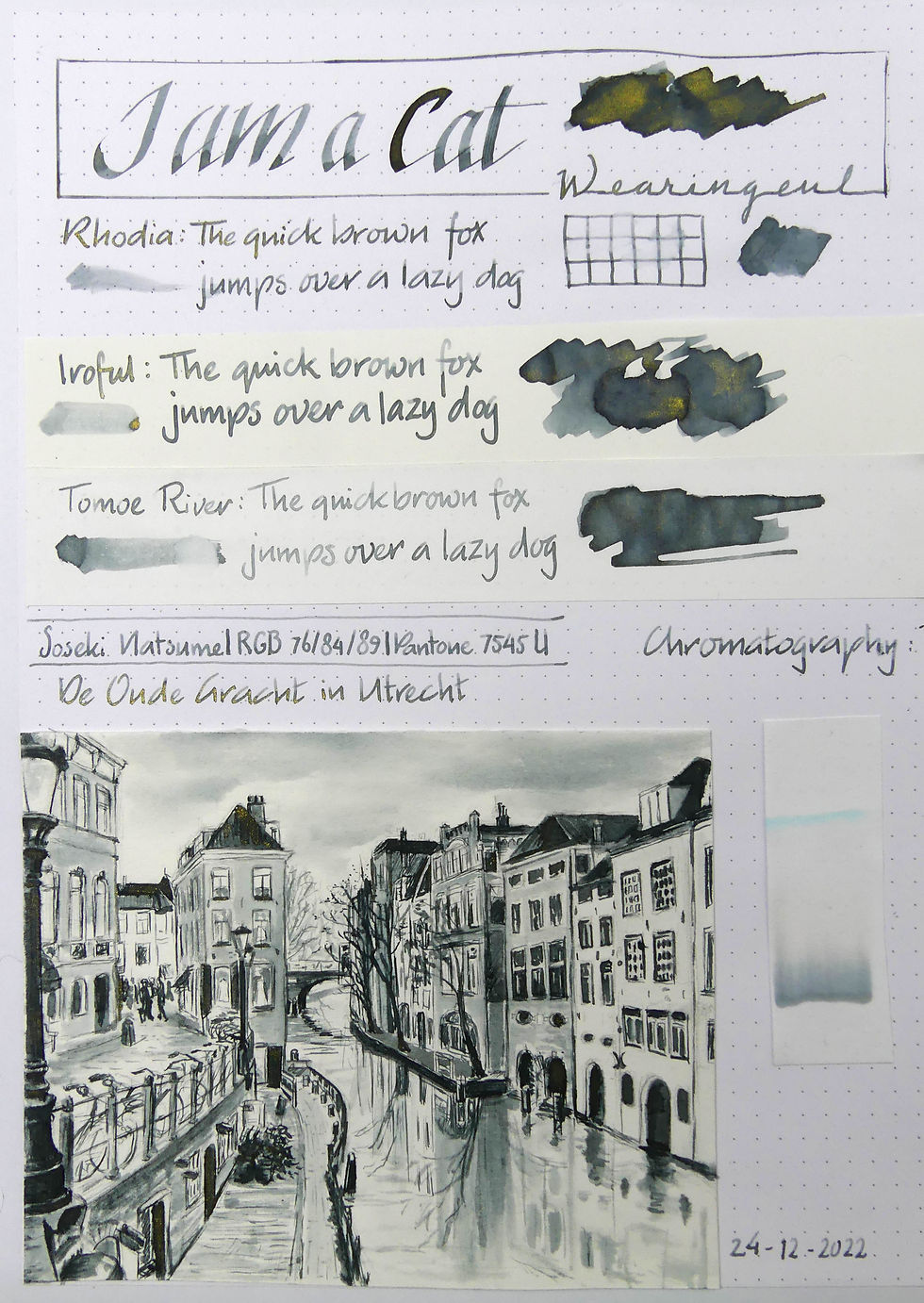
Now, the chromatography is interesting. at the bottom there is a grey line followed by a large part of pink. Then there is a small gap followed by another pink part. They seem to have a blue-ish undertone. Finally a big warm yellow part. To mix a nice brown you normally take purple and yellow or orange. So the blue tones pink and warm yellow make sense. The grey line is a mystery to me.
I made the sketch for this page during Christmas while visiting my parents. My mum had found some old photo albums for me to use as reference for my ink sketches. I immediately picked out this scene of me and my mum blowing bubbles in the summer of 1975. I turned 3 that summer. I love how glamourous my mum looks with her large sunglasses and striped kaftan tunic. We were on Schiermonnikoog that summer.

I love how this ink shows the pink undertones sometimes when I do the watery washes. Look at my mum's knee for instance. And in her arm too. I had to put down many layers of ink to get the dark brown that looks a lot like Burnt Sienna. I even had to let it dry overnight to add the last touches and details in the darker parts.


Comments